PX Mart Self-Checkout Kiosk
Designed the layout system and interface that guides shoppers of all ages through self-checkout.
2021

Challenge
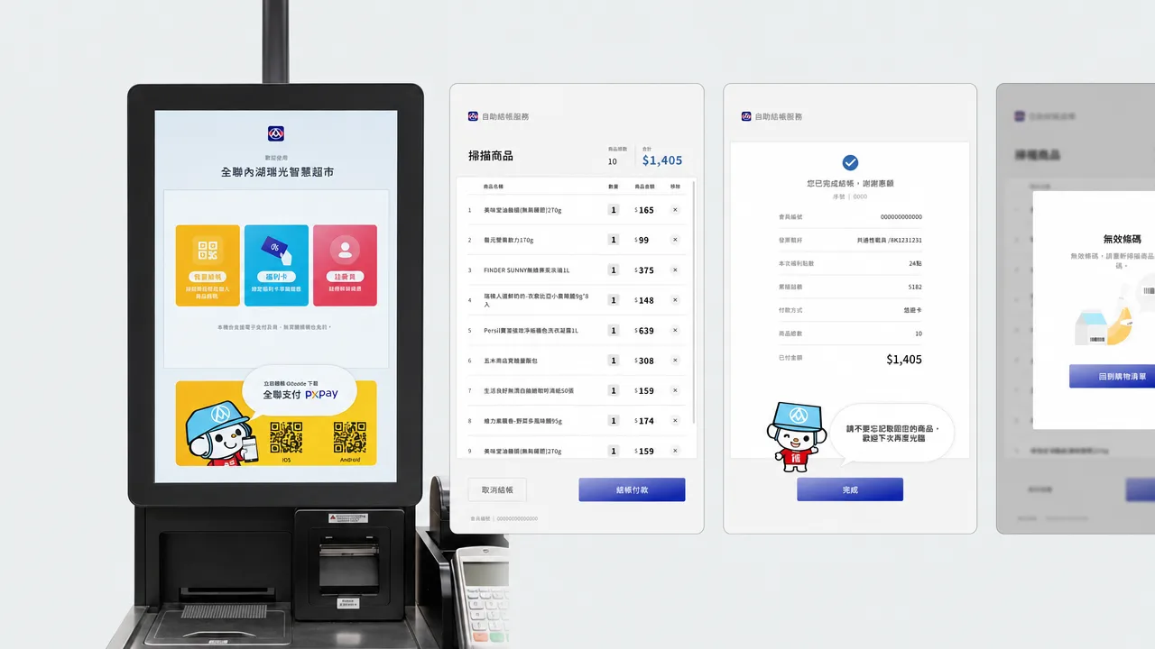
PX Mart was moving from traditional cashier lanes to self-service kiosks. My challenge was to design a checkout experience that millions of shoppers of all ages could use without help.
Approach
My design focused on three things: clarity, guidance, and real-world testing.
Clear information hierarchy
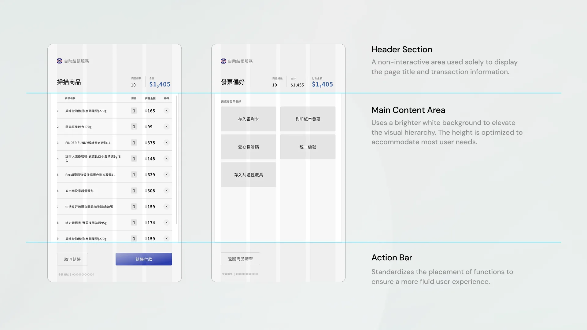
I kept the screen structure consistent at every step: header, main content, and action bar. This way customers always know where to look, from scanning items to paying.
The layout also considered the kiosk’s physical height and the average height of Taiwanese shoppers. I placed key information and buttons where they are comfortable to read and reach.
Realistic visuals for intuitive guidance
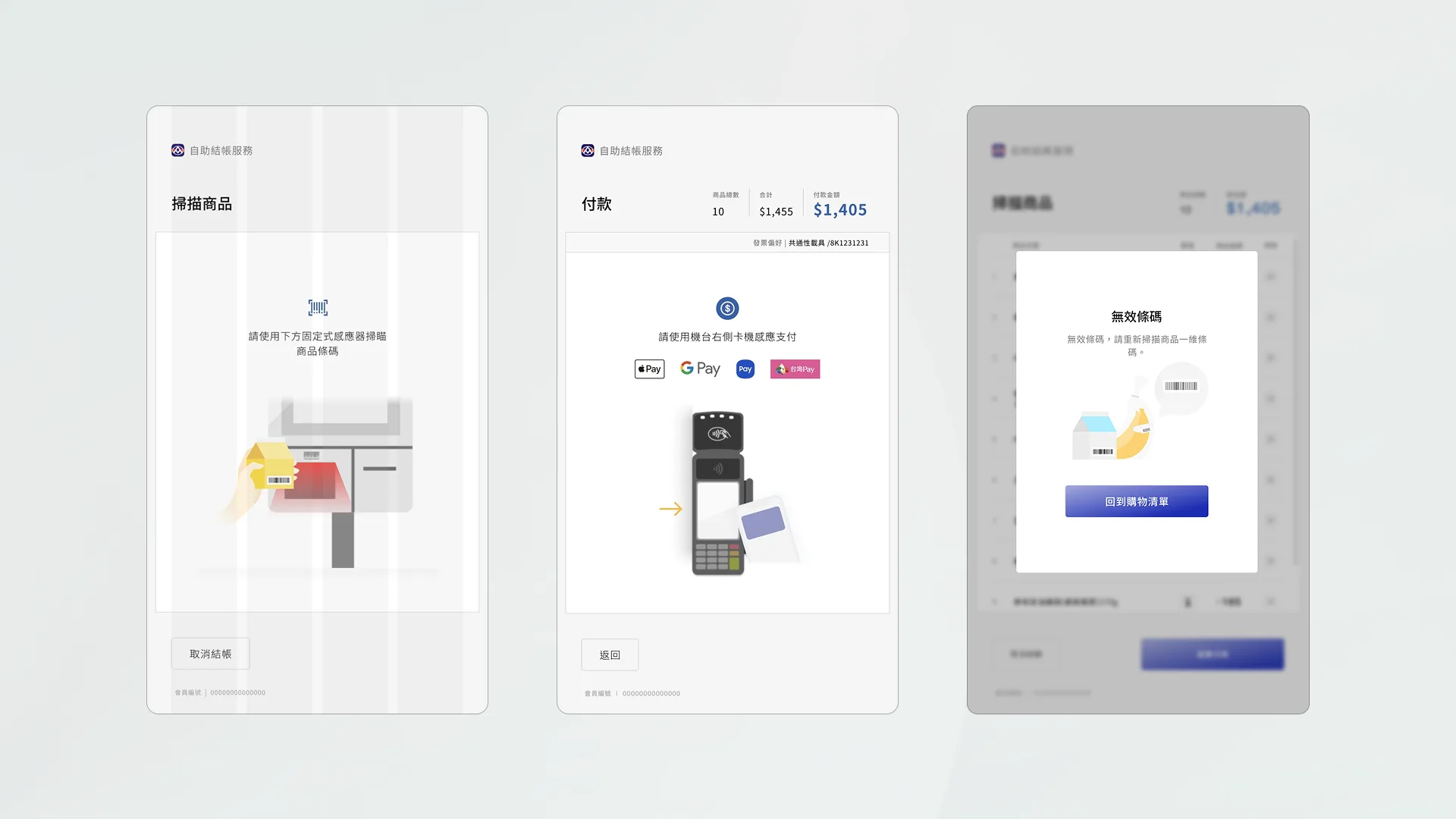
I designed the interface’s visual language with realistic icons and illustrations. Together with the team, we turned them into visual cues that show customers exactly what to do next, like where to scan a product or how to pay.
Iterative testing on physical hardware
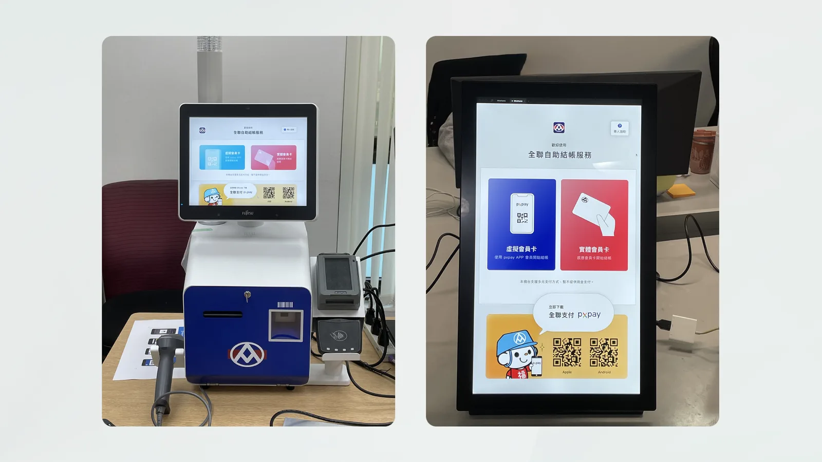
I tested and refined my designs directly on the actual kiosk screen. This let me adjust button sizes and placement for real fingers, and check that the flow felt natural in a real store.
Outcome
The kiosks are now deployed in multiple PX Mart stores in Taipei, giving shoppers a faster way to check out.